Showing posts with label vellum. Show all posts

Tuesday, June 9, 2026

Is it a VASE or a VAZZ Part 1

 I've always been a collector of little things that I could use for a new purpose - I'm sure I get that talent from my dad, who could design or make or build just about anything out of something else.   

Although you may know me as the "Card Connoisseur" - since I have been sharing my ideas on cardmaking for at least 5 years - I'd rather be known as the crafter who is inspired to use one pattern to create in many different mediums or forms. That's what you're going to see in Part I.   You may think you know what a VASE (or VAZZ) should or could look like, but you'll be challenged to think otherwise.  

My traditional VASES are one that you could put a grocery-store bouquet in, but I also have a tall, slender vase for one flower, like a rose; a fluted, heavy-weight vase and a tear-drop vase, both from my daughter; and a tall, frosted and etched pitcher with handle that was my parent's wedding gift, that I use for my dried flowers. On occasion these vases also hold a bouquet from the local florist.  But these three glass vessels do not inspire me to create another project with them.

Here are some variations of VASES or uses for vases.

I hot glued 2 tall plastic tubes (Amazon) in between 2 - 1" thick x 5" tall Birch Tree slices.  Then stuff moss in between to hide the tubes.  Add a ribbon and twine.  NOTE:   stand the wood slices on end before you glue them - they are not perfectly round and will lean to whatever shape it is.  You don't want your tubes to end up open to the side instead of the top.

Use one S & P Shaker (Salt & Pepper) as a vessel for dry flowers or fine stemmed real flowers.  I added a small! bit of water through the holes on the top, making sure the plug is in the bottom.   Just in case, I sat this VASE on a paper towel.  I found a dozen of these for FREE at a yard sale - Instant VASES for Baby's Breath flowers.


Do you see the tall necked VASE on the teapot bottom?  Attach it with E6000 glue.  Its waterproof but not winter weatherproof.

I have saved (from the landfill) many little glass bottles to use for real - dried, fresh, or artificial flowers.   In Spring and Summer, there is a sprig of a wildflower - like the one shown above in the birch wood, or a stem of carnations, or a bouquet from my garden or the grocery store.  

Today's project was inspired by Jukiclub.com where the creator has a pattern of a pitcher which she cuts out of oil cloth and sews together on her sewing machine.   The minute I watched her video on Instagram or on her website, my creative mind started to wonder, "how could I make that out of paper?  And what kind(s) of paper would look the best?" That is how my creativity works!

I forwarded her pattern to my phone and printed it off on my laser printer.  There is no need for a color print, but the print helps size my pattern for a paper design.   Please give Jukiclub.com the credit for the original if you share this idea on the internet.  

Now! I have to tell you that I do not have a mathematical thought process!  But I sort of figured out the width of the paper pitcher - AFTER I had made a few of them.  


If the jar is 1 1/2" square, then two sides (2 being 1/2 of 4 sides) equal 3".  That ends up being the measurement of the narrowest (is that a word?) part of the pitcher, the top.  The purpose of knowing that top measurement is to make sure that your vessel will fit inside, because you are adding a square vessel (VASE) into a flat or oval shape Someone that's a math whizz can help.   I've already confused myself by trying to think of the shapes as a math problem - yikes!

First I made a pattern out of parchment paper.  

Cut two pieces of the pattern - this can be the same direction because there's no pattern to the paper (and its just your pattern).  Use clips to hold it together after you place it around the jar.   This step also helps you to decide where to put the adhesive to hold the two sides together.

Here's a view of the jar inside the paper pattern, from the top.

I chose heavy weight printed vellum for my paper VASE.  Make sure you don't make the mistake I made.  When you have an inside and outside of the paper (the inside print was much lighter in color) make sure to place one of the pattern pieces in the opposite direction.  

++Remembering that this paper pitcher will have two sides, be attached to each other just on the edges, which will create a "sleeve" type shape that will slide over your jar or vessel.   

This is the photo that shows the error - make sure to cut one piece out of the opposite direction 

I used a coordinating piece of vellum for the second side, making sure that I placed the pattern in the opposite direction.


Use a strong tape, like Tear & Tape, to secure the sides.


On the spout side, add the adhesive from the bottom, up to the spout.  I added a very small piece of Tear & Tape on the upper corner of the spout.  Its a hard place to add adhesive, but any further in makes the opening tighter.  

Add some real or dried flowers to your VASE and enjoy a colorful piece you've made.   Change it with the seasons or use a different type of paper.

Being a JJ - Junk Journalist, I have coffee-stained bookpage on my mind, and wanted a more subtle paper for my VASE pitcher.


I really do like the way this bookpage pitcher turned out.  I think the black drips and subtle color bring character and make it look more realistic.   Now my creative mind is already thinking about music page or even old black and white photos - there'll be no end to what I try.

VASE or VAZZ Part 2 will show how to enclose flowers in a rounded vase inside a card that actually folds flat.    

Thanks for stopping by.   Be inspired.  Be Blessed.  Now go get creative! sb


Thursday, July 25, 2024

CHANGING SEASONS with LEAVES

 While many might automatically think of Fall or Autumn, since these new products were released in July, my mind automatically went to all four seasons which we have here in the Northern Hemisphere. 

Spring is a long-awaited season.  It is the season when leaves appear on our naked cold wintering trees, and these leaves are the hope we long for that winter is over.   The leaves of Spring are often a light, but brilliant green not found in other seasons.  Its as if God has saved this color just to get our attention and celebrate.

The leaves of summer are full bodied green.  The leaves are far more than foliage on our trees, they are protection and safe havens for our birds and small critters, and are the sign that our trees are alive.

The leaves of  in the Fall or Autumn in the Northern Hemisphere change colors, depending on the amount of light from the previous season.   And while the Fall signals another big change is coming, you can't help but enjoy this change from green to a variety of colors.


When Winter comes along in November or later and often lasts through April, the leaves have fallen away, so there are no leaves on the trees then. I imagine if any were to remain they would be frozen, covered in snow or frosty.

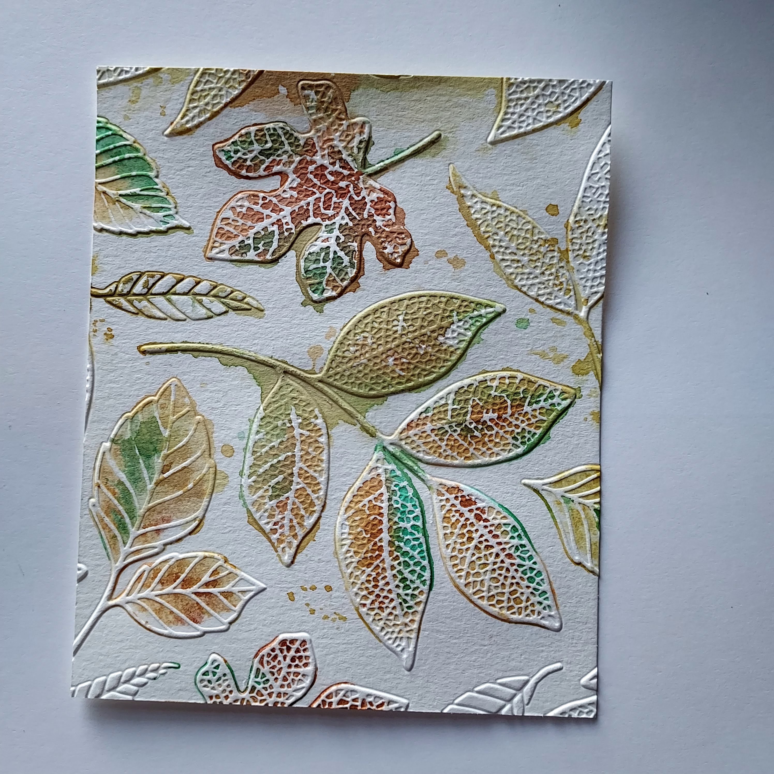
TECHNIQUE #1 - REVERSE EMBOSSING WITH INK ON WATER COLOR PAPER

The products I used are: Water Color Paper 4x6, Embossing Machine, Embossing folder, clean water, ink for leaf color, another ink for background color, water painter or paint brush. Note that the ink doesn't have to be the realistic leaf color  (Old Olive or Granny Apple Green for the leaves. Blueberry Bushel for the background)

On a 6x6 or 4x6 piece of water Color Paper, emboss the leaves with the Embossing folder, but don't include the die.   On the DEbossed side of the leaves - that's the imprint that is lower or down in from the background of the design - drop a few drops of clean water, then with a water painter or small brush paint brush, add a small amount of ink from your ink pad or from the re-inker bottle that you have created a puddle of ink with.   When you add the ink to the drops of water, it will flow as you move it slowly around the leaf, making sure to stay within the embossed leaf shape.

Dry with a heat tool. 

With background color ink pad.  Open the ink pad and drag it across the debossed side of the print. You may know this as Reverse Embossing.  Start at the top or one end, and drag in one stroke, the pad over the entired piece.  Don't press too hard because you don't want too much background ink on the leaves. Its OK though if that happens - its art.  Move the ink pad to the next section of the print and drag it in only one direction again, and repeat until the whole print background is covered with the ink.  Refrain from going back and filling in spaces, as you don't want the straight line edge of the pad to make marks. You'll discover how you want your prints to look.   

Dry with a heat tool.   Use as is or cut out some leaves and mount on a coordinating cardstock as I have done on the print above.

TECHNIQUE #2 - DRY EMBOSS WITH WATER COLOR PAPER (This print is my favorite) I have always loved blues and greens together

Water color paper 4x6, Grass Green Ink, Blueberry Bushel Ink for Background, Water Painter Brush or Paint Brush, clean water

With this technique you are doing the opposites of #1. The colors I chose for this remind me of the leaves of summer and the brilliant blue sky.  On the EMbossed leaves - that's the raised above side: Use a damp (not wet) paint brush, add ink from the stamp pad or a puddle of re-inker ink, and paint it around within the leaf, making sure to stay in the leaf. 

Dry with a heat tool.  You want to make sure these images are dry before painting the background so the colors don't bleed together.  But if they do - its art.  With a clean damp brush, add ink from the pad or puddle on the background spaces, bringing it UP TO the edge of the leave. 

TECHNIQUE #3  ADD INK TO THE EMBOSSING FOLDER FROM THE INK PAD

Embossing Folder, Embossing Machine, Water Color Paper, 3 or more colors of ink pads.

                                            Real Red, Wild Wheat, Grass Green, Pecan Pie Inks

With Ink pad, blending brush or sponge dauber, add inks randomly to both sides of the Embossing Folder, inking both the leaves and the background, and leaving some spaces without ink. Spritz both sides with water. NOTE that the back side of the E. Folder (that doesn't have the square SU image on it) is the DE bossed side, and the ink will go down into the leaf.  The EMbossed side, which is the top or the front of the E. Folder, the ink will go onto the background.  Put a 6x6 or 4x6 piece of water color paper in and machine and emboss.  You will get two different prints, one on each side of the paper. Now before the ink dries or before you clean it off,  spritz again and put another piece in and emboss again to get yet another print. 

TECHNIQUE #4 REVERSE EMBOSSING ON THE EMBOSSING FOLDER

Embossing Folder, Embossing Machine, Water Color Paper, Ink Pad


This view shows the DEbossed side.  I think you can see that the ink is below the background.

This view is the opposite with the ink on the EMbossed, where the leaf and ink is raised above the background.

This is similar to the Reverse Embossing, except that you are covering the Embossing Folder with the ink and not the paper.  Drag the ink pad across the front and back of the E Folder, completely covering the folder. Put the dry Water Color paper in. Emboss.  Check which side you like. You may decide to spritz the E. Folder to get the remaining ink off the folder - no ink is wasted.

TECHNIQUE #5  EMBOSSING WET CARDSTOCK

                                                            Here is the DEbossed side.


Here is the EMbossed side, after spritzing with water which produces a deeper impression.

TECHNIQUE #6 STAMP THE IMAGE  ON VELLUM WITH VERSAMARK/CLEAR EMBOSSING POWDER


I didn't plan this out first, so there were a few extra steps.  I heat embossed with clear embossing powder on vellum, thinking I would die cut them and be done.  But the leaves didn't show up like shown on the left image on vellum below.  So I put that pieced of heat embossed vellum into the embossing folder, and dry embossed it for texture, shown below on the right.  I didn't expect the image texture to be so detailed. 

Here's what I did then to create a card with a "wintery" leaf in mind.  

I heat embossed by stamping with Versa Mark, water mark ink with Clear Embossing powder on Night of Navy Cardstock   On Vellum, I stamped with Versa Mark and Clear Embossing powder, heat embossed.   I cut them out. 

Then I put the leaves, individually, in the Embossing Folder and embossed.  This brings out the details, and changes from see-through to opaque.  On the Debossed side, I outlined the leaves with the Slate Grey Blends marker.  

I glued the large leaf by the spines and stem and with very little glue, glued the stem of the small leaf.  

I'm so pleased with the texture and look of this technique which could be used for any season or reason.  Do you think you would try any of these "Changing Leaves" techniques? 

Monday, June 20, 2022

Vellum & Alcohol - a good mix


I've seen so many beautiful backgrounds made with alcohol inks and 91% alcohol, that I knew I had to learn this technique.  So I set off to watch what other crafters have done with this interesting combination.

MAKE sure you use 91% alcohol (not rubbing) but isopropyl.

USE CAUTION: Is isopropyl same as rubbing alcohol?
No – isopropyl alcohol and rubbing alcohol are not the same thing. Isopropyl alcohol is pure alcohol and is a colorless liquid with a musty, sharp odor. There are no other ingredients in a bottle of isopropyl alcohol. By contrast, rubbing alcohol contains isopropyl alcohol among other ingredients, such as water.

I decided to try a variety of papers and inks first, knowing that some may not work, because I wanted to debunk the "what if " scenarios before I started any projects.

1.  Water color paper - Why? you might ask would you use a porous paper?   Because I wanted to see how a saturated paper would respond. Even if it is wet it still does absorb any liquid that is on it.  So although you're not going to get the look of alcohol inks on vellum, you still get a unique design.


2.  Water based markers and water on vellum - Curls the paper too much, and it doesn't really blend. But based on what I learned about the difference between Rubbing Alcohol (71%) and Isopropyl (91%) Alcohol, perhaps the rubbing alcohol would work to create a more blended look with the water based markers. (You can see a hint of clear embossed text)


3.  Craft Ink with alcohol markers and 91% alcohol.  For this example, I used metallic gold craft ink thinking it would create a marble look. While the craft ink rose to the top and looked really neat,  it never dried, even with the use of the heat tool.  And because it never dried, it eventually curled into a roll.  I was disappointed - I really love the way these colors blended with the gold.


After trying these papers and ink combinations, I was able to get to the conclusion that you need the following supplies to make a background similar to the card at the beginning of this post:

*Vellum

*Alcohol markers - 2 or 3 for a color scheme (not a Sharpie marker)

*91% isopropyl alcohol NOT rubbing alcohol

*Straw or eye dropper - to move the alcohol around the vellum so it doesn't puddle in one space.

*Towels or paper towels

*Protection for your work surface

*Heat gun - CAUTION: when working with vellum and a heat gun, be aware that the vellum could melt or distort with the heat.

A shelf or counter to lay your vellum out to dry

Patience

I have to tell you right now, that if you like designs to be symmetrical or perfect in nature, then this is probably not for you.  But I hope you will try it - I couldn't stop once I got started.


BEGIN:

I've used Alcohol Blends Markers for this project. Choose two or three colors that coordinate OR choose two that coordinate, and one that is a sharp contrast. 


You may want to decide in advance what theme you will use for your back ground, such as: sky, water, night sky, sunrise or sunset, Christmas or fall harvest.  

Use either one, full size piece of vellum OR cut it into 4, 5 1/2 x 4 1/4 inch pieces. 

Step 1: With one color, scribble a spot of ink, randomly or in four corners, keeping in mind that the alcohol inks dry quickly.  With color two, scribble ink alongside of the first scribbles.  If using a third or accent color, add scribbles in the empty spaces, but less than the amount of the first two colors.


Step 2:  Lightly drop alcohol, by one or two drops on a few of the scribble spots of ink. (I used an eye dropper)  This can also be accomplished by spraying the alcohol with the Spritzer.  MAKE sure to protect your surface and surrounding areas. Once you put alcohol in the Spritzer, keep it only for alcohol.


Step 3: Move the alcohol so it blends and creates new spots.   I picked up the vellum and tipped it each way I wanted the alcohol to blend.  I have seen this process done either with a straw, eye dropper or the Spritzer. If there's too much alcohol, it washes away the alcohol ink, and can drip right off the edges of the paper.   


If you get too much liquid on top of the marker spots, lightly dab it off with a paper towel, OR try to heat set it from the underside of the vellum, making sure not to drip it on your work surface or floor.

The vellum prints may curl slightly until completely dry. You may wish to set a book or weighty object on top of it to keep it flat.

Trim your print when dry to fit your card base.  Layer as shown on the completed card or use as a back ground with a die cut.  OR use this background to die cut images for further use.

When attaching the vellum background to the card base, keep in mind that the glue or adhesive will show through.  Apply glue or adhesive to an area that may be covered like the print shown above, or that a die cut will fit over and hide the spot. If you do not have a spot to glue the vellum such as is listed above, use a sponge on a dab of glue, then lightly dab glue all over the back of your vellum piece.

The color of the cardstock layer beneath the vellum will definitely change how the finished print looks. I've posted the original colors again for a comparison.


Here are a variety of layer colors for you to compare:

The colors on each print is the background behind the vellum. Each die cut is Basic White, though it looks like pink in these photos.  The die set for this project is "Perched in a Tree" available July 1, 2022 from the NEW Mini Catalog.  

I liked Tahitian Tide for this print the best.   Tahitian Tide cardstock is used as the card base for both card designs.


Once I got some prints made and dried, I decided to try some heat embossing with clear embossing powder and then a light color of ink.  (Search this blog for the technique on how to emboss in any color) I would recommend using a darker color when embossing to show up more with the bright colors.


Here is one print that I embossed the butterflies in clear embossing powder and grey. Then I added die cut butterflies in Daffodil Yellow as an accent.   


The Sunflowers, shown above, were also colored in with the Blends (alcohol markers) on the reverse side.

Here is a cone flower I've die cut out of a background of vellum like I've demonstrated today.

Try making some backgrounds or due cuts with the vellum and 91% alcohol.  I'd love to see your creations.  

If you're new to paper crafting - card making, I'd love to show you more ideas.  And share with you the beautifully coordinated products of Stampin' Up!  To see the products from the latest catalogs, view my projects and learn of how you can save 20% on each order, go over to www.susanboback.stampinup.net.

Thanks for stopping by - be blessed! sb